Various chart types in share market.
- Mar 21, 2022
- 5 min read

Overview of charts
As an investor, you must be coming across the words like Open(O), High(H), Low(L), and Close(C). All these four points play an essential role in defining the trade pattern and also give a clear vision to the investor in deciding the next move to make a profit. Now, all four points should be described in such a way that the user gets a clear idea with a glance, and only charts have the potential to do so. So, every investor must be aware of the types of charts in stock market. There are various types of technical charts in stock market which are critical in understanding, and if you cannot interpret them correctly, you may lose your money.
Each intraday trading has 4 points OHLC, so if we want to see the data of 10 days, we will have 40 different points to get the information, now imagine what if we need to interpret the trend of last 6 months or a year, it might be so complex and challenging to understand if you are not aware of the various types of technical charts in stock market.
We all are aware of the charts that are generally used in day-to-day life, like Column charts, pie charts, area charts, etc. The only limitations which come with these types of charts are they cannot represent 4 points at one single time. Yes, but a line chart can do that. We can see 4 different lines at one particular time frame. We will see below the types of technical charts in stock market.
There are 3 major types of chart in Indian Stock market;
Line Chart
Bar Chart
Japanese Candlestick Chart
1. Line Chart:
Line Chart is the basic type of chart and uses one data point to frame the complete chart. This chart is created by plotting dots on the closing price of each day and is then connected to each other; one can use index also instead of the closing price.
If we want to see the closing price of the last 30 days, then we will have the line connecting 30 dots, and the pattern in the line will show the trend in the stock market in the last 30 days. Intraday traders use these chart patterns in Indian stock market to study the closing point and draw a conclusion.

One can use this chart type to interpret the various data of monthly, weekly, hourly, etc. So, if you need the data of, say, last week, then draw the line potting the dots of the previous week's closing points.
The main advantage of this type of chart is they are very easily understandable; their simplicity makes them easier to use by the majority of the people. The disadvantage is also its simplicity, it does not show all the points together, and that is the reason many people do not use this to make any conclusion. This can be used when you need to know only the closing points of a particular time frame.
2. Bar Chart:
The Bar Chart chart patterns in Indian stock market are more versatile than the line chart, as they can display all the four OHLC variables (open, high, low, and close). In this Bar, there are three components: the central line, the left mark, and the right mark.
The Central line indicates two things: the top part shows the highest price, and the bottom part shows the lowest price.
The left tick/ mark- indicates the opening price.
The Right tick/mark - indicates the closing price.

In the above diagram, X-axis represents the time (here months), and Y-axis represents the stock price. We can say this is a chart illustrating the average fluctuation in the price of some stock in the last 6 months.
We can see that the opening price in March is the highest compared to any other month, and stock faces the lowest closing price in June.
One can read and interpret the data in the above manner and can think of trading based on such interpretations. But if you are a beginner and starting fresh, we suggest you go for the Japanese Candlestick Bar because interpreting large data on bar chat can be complex. Some investors, though, prefer the bar charts for analysis. It ultimately depends on what type of visuals your brain can interpret faster, and you can choose that.
3. Japanese Candlestick Chart.
We have seen in the Bar chart the prices are shown on the line, whereas in the Japanese Candlestick, it is shown by the rectangular body on the line. In this chart type, Candles draw attention to whether the market is facing the bullish phase or bearish phase. You may customize the color of the candles as per your requirements. Generally, they are of red and black candles, Blue and green candles, the software setting allow you to choose your color.
Let us understand by an example the components of the Japanese Candlestick chart.
The Japanese Candlestick has 3 major components, the Central real body ( rectangular body), upper shadow, and lower shadow.

We can extract the clear difference between the Bullish market and the bearish market with the help of the Candlestick chart type.
Understanding the concept of time frame : A time frame can be understood as the duration one wants to study in the particular chart. Some of the majorly used time frames are daily (at the end of the day), Weekly, and Monthly Charts, which technical analysts use.
Some High-frequency traders may need to evaluate the smaller time frame data, say for 1 to 5 minutes, instead of the above mentioned, as they are involved in trading at the high frequency. ( in minutes)
Apart from these 3 major chart types, there are more charts to get the data from Renko Chart, Heikin Ashi Chart, and Point and figure chart.
Renko chart : is an invention of Japanese; in this chart, minor price fluctuations are wiped out, and only major changes are shown, which can be easy to evaluate the trend speedily, and the analyst can get the idea of the direction very fast.
Renko Chart is majorly used when an analyst wants to know the support and resistance level in the stock market.
Heikin Ashi Chart : is another type of chart used by the Japanese, it is somewhat similar to the Candlestick chart, but it does not have exact details on opening and closing prices. It just shows the upwards and downwards trends with red and green handles.
Point and figure chart : it is very easy to enter the data but quite tricky to understand the same for a beginner. This chart uses the combination of X and O. X represents the price rise, and O represents the downfall in the share price. It was used as a recording technique in the older times.
The data may tell you two things, either information or noise; noise is something called inaccurate data or something that distorts the stock trend, so, to make your trade successful, you must ignore the noise and look to the information.
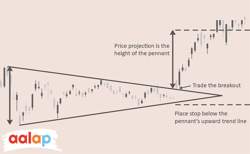
All the different chart patterns in stock market ultimately represent the trend, direction, movement in the price of the share. There are majorly 11 such trends that an investor must know in order to conclude his trade. We will see all different chart patterns in stock market with the reference of the image, they are self-explanatory and no description needed, but if you want to learn them, do write us, we will provide you with the explanation of all of them.
1. Ascending triangle trend :

2. Descending Triangle trend :

3. Symmetrical Triangle Trend :

4. Pennant :
5. Flag :

6. Wedge :

7. Double bottom :

8. Double Top :

9. Head and Shoulders :

10. Rounding Top or Bottom :

11. Cup and handle :


Comments